James Cropper has unveiled a new campaign that translates the visual identity of Manchester into a paper-based colour palette, presenting the project at the inaugural Manchester edition of The Independent Paper Show 2026.
Developed in collaboration with Winter & Company, The Colours of Manchester explores how colour can reflect the character of a city through its architecture, atmosphere and cultural references. The project was created using street photography and observational research to identify colours associated with Manchester’s built environment and everyday surroundings.

The final palette distils the city into six core Coloursource expressions
According to James Cropper, the campaign was based on the idea that cities are often recognised through colour before they are recognised through landmarks. The resulting palette captures tones observed across Manchester, including tramline yellow, industrial brickwork, canal reflections and the greys of the city’s skyline.
The final collection comprises six Coloursource expressions: Vermillion, Azure, Bright Yellow, Grey, Chartreuse and Mandarin. These were selected from a wider range of colours identified across the city and linked to locations, structures and visual details familiar to local residents.
“Before colour becomes branding, it is place,” said Jordan Scott, head of marketing for James Cropper. “Manchester has a visual language entirely its own, shaped by weather, music, architecture, sport and industry. This project was about observing those details closely and translating them into paper in a way that feels emotionally true to the city.”
Ahead of the show, James Cropper ran a social media campaign asking people to answer the question: “What colour is Manchester?” Responses referenced elements including the city’s tram network, worker-bee symbolism, canal water, football culture, brickwork and overcast skies. The feedback informed the wider project and contributed to the final interpretation of the city’s colour palette.
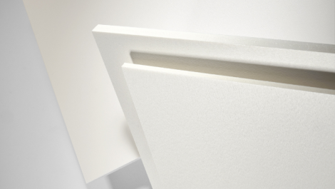
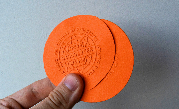
At The Independent Paper Show, the campaign was presented through a pared-back exhibition space featuring large-format photography, paper samples and embossed takeaways produced at the company’s mill in Cumbria. Visitors were invited to select and emboss their own interpretation of Manchester’s defining colour.
James Cropper said the project also highlights its ongoing partnership with Winter & Company around the Coloursource collection. The company added that the campaign demonstrates how paper can be used to capture and communicate a sense of place through colour and material design.