Inner pages for the new brochure were printed using an HP Indigo 7900.
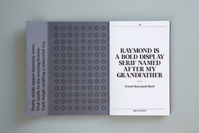
Typography designer Daniel Reed has created a new font, inspired by his late grandfather, Ernest Raymond Reed, a World War 2 veteran with the GHQ Liaison Regiment.
The font – titled simply Raymond – is showcased in a new A5 loop-stitched brochure that has been launched to coincide with Remembrance Day, the inner pages of which have been printed digitally by ASAP Digital on an HP Indigo 7900. Recycled papers were used for both cover and inner pages: Arjowiggins Graphic’s Cocoon Offset 100% recycled paper and Cyclus Offset. The cover and outer feature a grey spot colour (printed litho).
Arjowiggins and Antalis are using the brochure, which includes wartime photos of Ernest Raymond Reed, as part of a new campaign, including a teaser e-shot, mailer to designers, printers and end users, and a social media competition.
Mark Hutchinson, director at ASAP Digital, commented: ‘Having worked with Daniel on previous projects, we were really excited to support Raymond, especially with his grandfather’s inspiring backstory and personal history throughout the brochure. The project has been completely individualised, with hand-folded inner-leaves, distinct images and powerful words, all printed on Cyclus and Cocoon paper that really brought the piece to life.’
The GHQ Liaison Regiment (also known as Phantom) was a special reconnaissance unit that was tasked with reporting back accurate information on Allied troop positions to headquarters. It had important roles in both Operation Overlord (the D-Day landings in Normandy) and Operation Market Garden (the ill-fated attack by paratroopers at Arnhem). Among its high-profile officers were actors such as David Niven, MPs, journalists and sportsmen, including the champion jockey Sir Gordon Richards.
Daniel Reed explained: ‘With each new typeface I create, I always develop a backstory to help contextualize it’s design. I find that having something tangible that I can work to helps me focus my ideas instead of making a typeface for aesthetics alone. My latest font, Raymond, inspired by my grandfather Ernest Raymond Reed, has roots in serifs from the early 20th century. It is bold and confident with a refined and historic look with large accented serifs. Given its historical and more dated design, I thought my grandfather’s experience in the war would be a perfect narrative to bring it to life.’