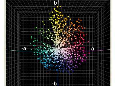
In ICC technology the reference colour space is a device independent colour space, CIE Lab
It’s now 25 years since the International Color Consortium (ICC) was formed and ICC colour management technology introduced.
The ICC started as a joint effort between Adobe, Agfa, Apple, Kodak and Microsoft. Their idea was that colour management should be done starting at the computer operating system level, and that all applications should do it in the same way. This would add both consistency and ease of use. The ICC invented a standard file format for colour conversions: profiles.
The ICC’s colour scientists also decided that colours should be defined neither in CMYK nor RGB (Red, Green, Blue) colour spaces, because doing so limits what can be done with the colour data. Instead the ICC technology is based on the CIE Lab and CIE XYZ colour spaces which are much larger. These colour spaces are collections of mathematical definitions of all the colours humans can perceive, which is way more than either CMYK or RGB can represent.
Why a device independent colour space?
As a designer you might wonder why this needs to be so complicated and technical: can’t we just use RGB or CMYK for simplicity? Well, we can’t, because the appearance of colours is so subjective. In both CMYK and RGB it depends on how the device rendering the colours behaves. Not all monitors show the same colour for a given value of RGB, not even white or black. The same goes for prints. The Cyan will look different, depending on the inks and paper used and on the printing method.
The ICC’s approach defines colours within a much larger colour space than the CMYK or RGB colour spaces, so that how they look is not influenced by the peculiarities of a particular imaging device. Inside ICC profiles colours are defined by a numeric value, based on where they are in the CIE Lab or CIE XYZ colour space.
Lighting up
In an ICC profile the reference lighting is normally expected to be standardised daylight. This is defined as D50, an artificial light with a certain spectral distribution at 5000Kelvin. However you can convert the reference lighting to other types of light, such as D65 (6500K) as is used in Adobe RGB and sRGB.
Colour conversions
To make a colour conversion from for example RGB to a print specific combination of CMYK, you need to know or specify what type of RGB your image is referring to, as well as the correct ICC profile for your print production. Adobe RGB and sRGB are among the most popular for photos, but you need to know which one has been applied to your images in order to handle the conversions correctly.
What devices do I need to calibrate?
As a designer you must calibrate your monitor, if you want to see colour accurate artwork and images. For this you will need a colorimeter or spectrophotometer. If you buy a high end proofing monitor the manufacturer will provide dedicated software for calibrating it.
The monitor software will also support the most commonly used colorimeters and spectrophotometers. In the process of calibrating your monitor, you will create a unique ICC profile for it. This ICC profile will define the colour characteristics of your monitor as it is setup by you. Inside the ICC profile is a table mapping how the monitor’s RGB values correspond to values in CIE Lab, and how they will be used by the colour management system to display colours correctly.
All apps compatible with ICC support soft- and hardcopy colour accurate proofing eg Adobe Photoshop, using Fogra 30 ICC profile to make prints compliant with ISO 12647-2
Colour accurate proofs
If you want to make colour accurate proofs on your colour printer, you will also need to buy a spectrophotometer and possibly some special software to calibrate the printing device. If you are serious about colour accurate print production, and do lots of hard copy proofing, it’s worth the effort to invest in a high end raster image processor (RIP) so that you have a completely colour accurate proofing system.
This can be a step too far for many designers as most prefer to do colour accurate soft proofing on screen, typically through Adobe CC and/or Adobe Acrobat. But remember, colour accurate softproofing isn’t possible unless your monitor is calibrated and stable over time. Investing in a good monitor and learning how to calibrate it correctly is an important and necessary step for your wild format projects.
How do I do softcopy proofing?
First make sure that you have established stable conditions for your monitor, avoiding strong light shining onto its surface and checking that it’s set to the brightness and whitepoint you want. This could be for example D50 at a brightness of 160cd/sqm (Candela per square metre is a measure of luminance often used to measure the brightness of monitors). Once it’s set, Adobe CC and other ICC compatible software can use your unique monitor ICC profile for all colour conversions and display colours accurately. You won’t see your ICC profile mentioned in the colour settings in the Adobe software, but if you want to double check which ICC profile is active for the monitor, go into the Systems Preferences on a Mac or Settings in Windows to find out.
In order to preview or softproof your design colour accurately on your calibrated monitor, you need an additional ICC profile for the output method to be used in final production. This profile describes the output device’s colour characteristics and a colour savvy printing company can provide you with such profiles. You copy the profile(s) to the systems folder on your computer and you can now tell Adobe CC what the output CMYK colour space is, and ask for a colour accurate preview on your calibrated monitor. This is what is meant by softproofing.
Artwork can still be in RGB because it’s only temporarily converted to CMYK for viewing on the monitor, showing you a colour accurate softproof of what your work will look like in print. If you want, you can make a final conversion to CMYK at this stage, but if you change your mind about what printing technology you want to use, this conversion isn’t valid. Keep back-up copies of the RGB file if you want the flexibility to chose different print methods.
Another way to do the colour conversion is to create PDF files and to do the colour conversion automatically when the PDFs are generated. The relevant ICC profile will be embedded inside the PDF ready for the printing company.
How do I do hardcopy proofing?
Just as you can use a calibrated monitor to simulate how your artwork will look printed in CMYK, you can use a calibrated colour printer for a hardcopy version. The printer has to have a colour gamut large enough to mimic the colours the final printing device and its inks will produce. As with your monitor, you can calibrate a colour printer using ICC technology to get a unique ICC profile. By telling the colour management system that you want the output to match a certain printing device (and not your monitor or your colour printer), you can create colour accurate hardcopy proofs yourself.
You will use the same type of procedure and technology as if you ordered hardcopy proofs from your print service provider. Most hardcopy proofs today are produced on high quality inkjet printers, typically from Canon, Epson or HP. But the beauty of digital large format production is that the proofs can also be made in the very same digital printer which will be used for the final production. This is of course the ideal situation, because then the proof sample uses the exact same inks, substrate and printing technology, as the final print run.
Spot the difference
The ICC technology only provides good colour management for working in either RGB, CMYK or greyscale. While you can call for spot colours in your designs, they are not very well displayed or colour managed unless you use a special application such as the tools EFI provides as part of its Color Profiler Suite. There are developments underway to improve colour management for spot colours in the latest version of ICC’s technology, but either way you must learn to properly colour manage RGB and CMYK in your processes to get the best results.
By learning about and applying ICC technology you can preview colours in your artwork as they will appear in the final print. This will help you avoid colour errors and so reduce waste and disappointments. It will also save time, expense and stress, so build up your knowledge and experience to master it and give yourself a value added edge.
The Wild Format guides are intended to expand awareness and understanding of the craziness that can be created on wide format digital printing devices, from floors to lampshades and everything in between.
These guides are made possible by a group of manufacturers working together with Digital Dots.
This article is supported by Efi, Fujifilm, HP and Digital Dots.
Together we hope you enjoy the articles and that you put into practice what you learn. If you want to talk about it, go to our LinkedIn group.
Enjoy and Go Wild!


